Ruckstuhl shows its colours.
We are convinced that colour has a harmonising effect on our lives.
We are convinced that colour has a harmonising effect on our lives.
For Ruckstuhl, colour has always been a central design element that can be used to enhance the effect of a particular material. We are convinced that colour has a harmonising effect on our lives. This is especially important in restless, hectic times. It is therefore impossible to imagine our design work without colour.
The element of colour has always played an important role, in some regions less, in others more. Let us think, for example, of Scandinavian architecture or the colour impressions of Italian architecture from the late Middle Ages to the pre-renaissance period. Not everywhere requires the same amount of colour. In the Mediterranean regions, architecture is predominantly white.
In the Mediterranean regions, architecture is predominantly white; there, the strong sun makes the sky and nature glow powerfully in all shades of colour.
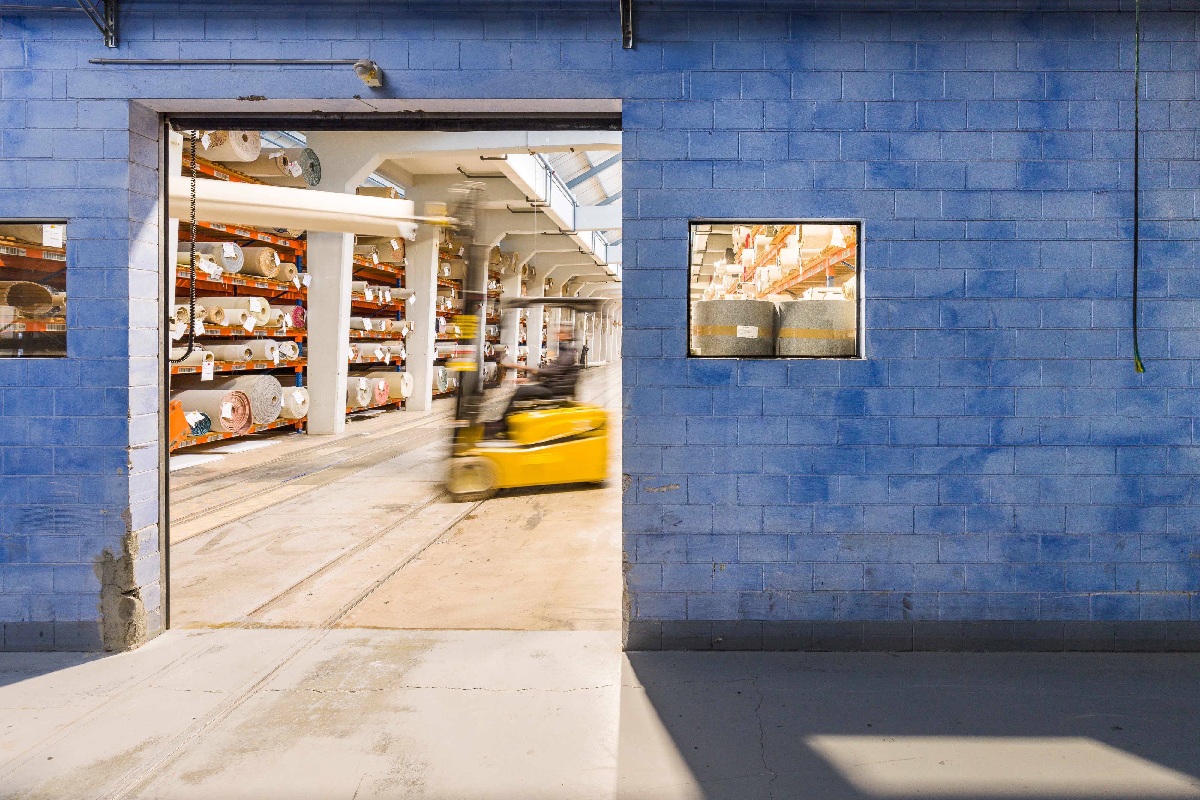
Ruckstuhl wants to show its commitment to colour not only in its product range, but also in its immediate surroundings, whether indoors or outdoors.
For a good 30 years, we have been constantly expanding and adapting our entire room infrastructure in terms of colour. Each building and each room is given a colour that corresponds to its function.